There are different ways to define mandatory fields in Salesforce:
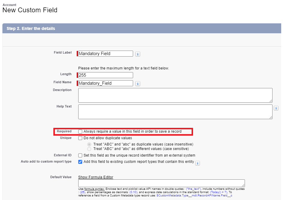
- On “database level”: When you create a new custom field, you can define this field as “required”:

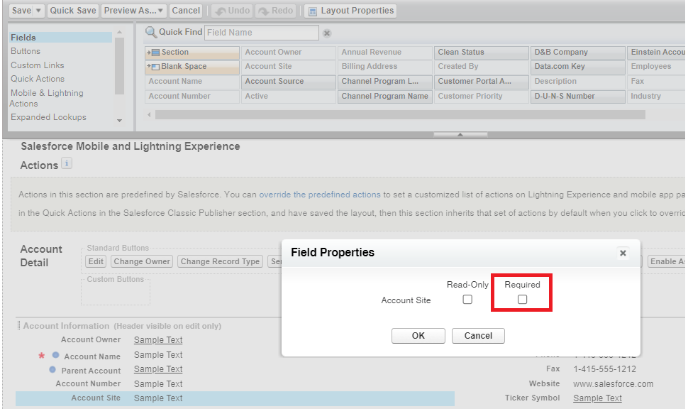
This field has to be populated, regardles of the type of populating. Through the API or Dataloader, through Apex or Flow or through the user interface. If you want to create a record in the database, you have to populate the field. - On layout/ dynamic forms leve: When you add a field to a layout or a lightning page, you can define this as requried:

If you use dynamic forms:
In both cases the field is only required, if you create a record throug the user interface. If you use the API, Dataloader or Apex the field is NOT mandatory.
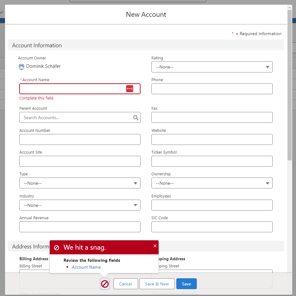
On the user interface, the behaviour of the mandatory field validation is identical, regardless of whether the mandatory field was defined at database level or layout level. However, the presentation of the objects differs slightly. The account object looks like this:
Every mandatory field is marked and at the bottom you have a pop-up which lists all missing mandatory fields. The field-name is a hyperlink. If you click on the field-name your screen will scroll to this field.
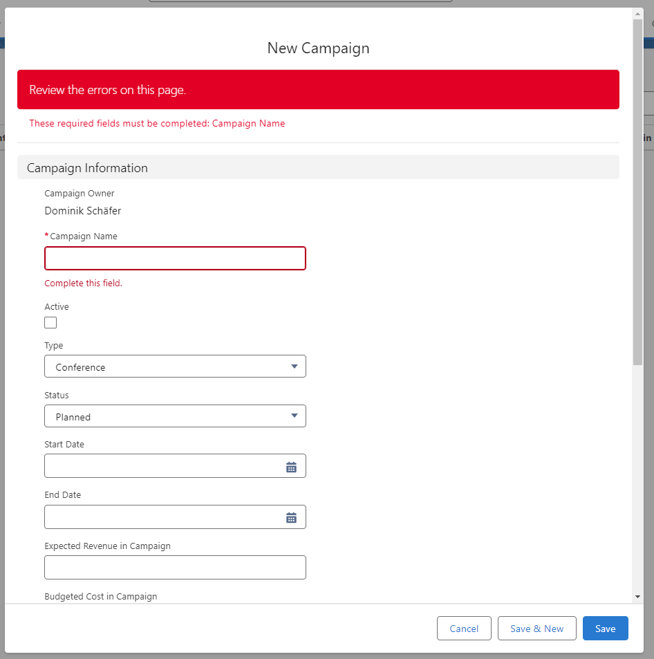
But on campaign it looks like this:
All the fields are marked the same way. But you do not have a pop-up at the bottom. Instead you have at the top the information. The field-names are no hyperlinks.
I did not find any official article/ information about this behaviour. Did you noticed this diffrence already? What do you think about it?